Wednesday, March 23, 2011

Melbourne Sports Museum Critiques

Australian Institute of Sport
Designer: Unknown
Vector Image


The Australian Institute of Sports (AIS) logo displays strong use of shape, colour and rhythm in its composition, the contrast of colours which are also the main colours of the Australian flag allow the large central shape to ‘pop’ out at a viewer. Its simplicity in shapes becomes very easy on the eye and the rhythmic loop created by the dynamic direction of the blue shapes draws the focus down towards the title. This smooth transition of focus from center to top and back down to the bottom ensures that someone will see and remember the entire image. 


The large solid shapes really make the logo what it is, strong and bold, it gives the AIS a clear and identifiable image and identity, this is supported by the equally strong and bold letterform used, creating a rhythmic loop across the logo. For this reason I believe that this logo is extremely effective and successful in achieving its intention, creating a sense of strength and power would seem to be a concept important to a sports industry, teamed with the colours reminiscent of the Australian flag, the symmetrical composition and word Australian above all other text create a sense of unity and nationalism, which is important aspect when designing for a national institution. 


Olympics - Montreal 1976
Designers: Ernst Roch & Rolf Harder
Poster


The Montreal Olympic games poster is an excellent and very original adaptation of the Olympic rings. The use of scale and positive/negative space is most prominent around the logo, whereas the use of repetition and line make the logo stand out. A strong sense of movement is created through the repetition of the rings, fading outward helps to maintain focus on the centre of the poster and imagery. 


The visual repetition created is symbolic of the movement seen in an Olympic games as well as the idea of the 5 continents of the world converging in Montreal. The scale of rings on the poster and large vast areas of negative space reenforces this idea, having the rings significantly larger than  all other graphic elements on the page causes this to become the central focal point, much like the concept suggests. Colour is also used in a very subtle way in order to inform a viewer further, the black ring is the only ring that fades out towards the top leading towards the title, also black. The small red logo in the top left and text in bottom left could also be seen as creating a slight rhythmic loop across the design with the far right red ring.


Personally I thought that this poster, amongst all of the other Olympic posters stood out at the museum, it has a very different look and style and had the ability to set itself apart from the rest, the concept of movement, unity and convergence of the world also stood out and separated itself from all other Olympic themes.  


http://tiny.cc/rgjul
http://tiny.cc/xcsop
http://tiny.cc/rdiyg

Tuesday, March 22, 2011

Critiquing Tools

Art Vocabulary

Negative Space - the area of a design that has been left blank (often intentionally) these area’s highlights and places emphasis on areas of positive space (Subject of design), the negative space of a design can also create  interest through its shape.
Asymmetry - The opposite of symmetry, asymmetric compositions are not equal on either side of a design, this is often seen in qualities of the design balance and hierarchy.
Palette - in art a palette could be a small or large group of colours used in a designs composition, palettes are often carefully chosen and help to convey the message of the design, i.e. cool, or warm, happy or sad.
Hierarchy - the arrangement of elements and principles of a design on a page, the hierarchy of a certain object determines its importance and relevance on a page.
Scale: exadurated - an exadurated scale will show and extreme use of mis proportioned content, this may be used to create asymmetrical relationship between elements of design.

Adjectives

Geometric - Strong, hard edged and man made lines and shapes.
Organic - free, flowing and natural lines made without restraint or measurement.
Shade - colour that has had black added to the original hue in order to achieve a darker tint of the original colour or hue.
Tint - colour that has had white pigment or value added to achieve a lighter tint of the original hue.
Vertical - Lines are very strong and imposing, very male in its approach.

Principles & Elements

Line - the basis that all elements begin, line is the most versatile of all elements, can be straight, curved, irregular, regular, thick, thin, strong or soft.
Colour - heightens the emotions and dimensions of a design, colour can give meaning and feeling to a design.
Texture - tactile and visual texture is the look and feel of design characteristics.
Shape & Form - shape is created by the convergence of lines, it is unlimited to amount of sides and surface area, form is created when tone is added to a shape, giving it a third dimension.

Stability - Compositions elements are arranged in an almost symmetrical manner, vertical and horizontal lines , shapes and directions are most prominent in a stable composition.
Dynamics - dynamics are the opposite of stability, elements are moving in diagonal directions often off of the page, this gives the implication and feeling of movement in the design.
Rythm - the repetition or alteration of graphic elements on a page, Rythm is the key to creating a successful pattern or texture effect.
Scale - the enlargement or reduction of elements in relation to each other or other elements on a page to contrast with each other.

Monday, March 14, 2011

Style Time Line

Anti-realism - Base for many movements
Anti-Realism is strongly based on analytic philosophy making it hard to give the movement a specific date, the term anti-realism is used to describe any position involving either the denial of an objective reality of entities of a certain type or the denial that verification-transcendent statements about a type of entity are either true or false. put shorts its the denail of the knowledge we poses in day to day life, an anti or negative position to the mainstream way of thinking.  As well as existing in Science, literature and Mathematics, in art ,anti-realism and anti-realist may be used in contrast to realism, this means that other art movements such as surrealism and psychedelic bands common in the 1960s were “anti-realist”.
Ricardo Asch shows a more modern adaption of Anti-Realism
Frida Kahlo also shows connections to anti-realism ways of provocking thoughts and images.


Info & Images
http://en.wikipedia.org/wiki/Anti-realism
http://www.ricardoaschfotos.com/


Fururism - 1909
An Italian avant-garde art movement that came into being with the appearance of a manifesto published by the poet Filippo Marinetti on the front page of the February 20, 1909, issue of Le Figaro. Futurism took speed, technology and modernity as its inspiration, portraying the dynamic character of 20th century life, glorifing war, the machine age, and favoured the growth of Fascism. The aim was to portray sensations as a “synthesis of what one remembers and of what one sees”, and to capture what they called the ‘force lines’ of objects.
Movement was strongest from 1909 and continued this way until the 1930’s, The movement is still seen and applied today.
Giacomo Balla is one of the first people to take to the futurism movement, being a signatory on Filippo Marinetti’s manifesto.
Augustine Kofie is regarded as a modern Futurism artist and brings a connection between futurism and street art.


Info & Images
http://www.artmovements.co.uk/futurism.htm
http://www.huntfor.com/arthistory/C20th/futurism.htm
http://en.wikipedia.org/wiki/Futurism
http://tiny.cc/usl3k
www.keepdrafting.com


Metaphysical painting - 1911
Metaphysical painting flourished mainly between 1911 and 1920, a style involving engaging the unconscious mind, beyond physical reality, hence the name..  Metaphysical painting originated with de Chirico. In Munich, Germany, where he spent his formative years, de Chirico was attracted to 19th-century German Romantic painting and to the works of the philosophers Arthur Schopenhauer and Friedrich Nietzsche. The metaphysical movement provided significant impetus for the development of Dada and Surrealism.
The works of the Italian artists Giorgio de Chirico and Carlo Carrà turned metaphycial painting into a mainstream sect of art.


Info & Images
http://www.britannica.com/EBchecked/topic/377908/Metaphysical-painting
http://en.wikipedia.org/wiki/Metaphysical_art
http://tiny.cc/ww83q


Harlem Renassance - 1920
The Harlem Renaissanceand at the time known as the “New Negro Movement” was an expression of African-American social thought and culture which took a place in newly-formed Black community in neighborhood of Harlem. The Harlem Renaissance flourished from early 1920 to1940 and was expressed through every cultural medium-visual art, dance, music, theatre, literature, poetry, history, politics and consequently allowing African-American culture to be absorbed into mainstream culture.
Jacob Lawrence and Romare Bearden are among the best-known twentieth century African American painters. Lawrence Became Nationally famous with his “Migration Series” released only in his 20’s.


Info & Images
http://www.huntfor.com/arthistory/C20th/harrenaiss.htm
http://en.wikipedia.org/wiki/Jacob_Lawrence
http://en.wikipedia.org/wiki/Romare_Bearden
http://tiny.cc/0xj4e


Socialist Realism - 1932
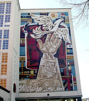
Socialist realism is a style of realistic art which was developed under Socialism in the Soviet Union and became a dominant style in other communist countries.  Socialist realism was the officially approved type of art in the Soviet Union for nearly sixty years and should not be mistaken for Social Realism, a type of art that realistically depicts subjects of social. Socialist realism held that successful art depicts and glorifies the proletariat’s struggle toward socialist progress, the Soviet Union making the art form a state policy in 1932 to spread proaganda the art depicted the common worker, whether factory or agricultural, by presenting his life, work, and recreation as admirable. In other words, its goal was to educate the people in the goals and meaning of Communism. The ultimate aim was to create what Lenin called “an entirely new type of human being”
Notable artists include  Walter Womacka and Sergey Malyutin


Info & Images
http://www.britannica.com/EBchecked/topic/551721/Socialist-Realism
http://en.wikipedia.org/wiki/Socialist_realism
http://tiny.cc/24fhv


Op Art - 1938
Op Art also known as Optical Art, began in the 1960’s but examples can be dated as far as 1938. Op art is a non-representational art form with strong use of Perspective and Juxtapozing colours. Invloves a method of painting concerning the interaction between illusion and picture plane, between understanding and seeing.” Op art works are abstract, with many of the better known pieces made in only black and white. When the viewer looks at them, the impression is given of movement, hidden images, flashing and vibration, patterns, or alternatively, of swelling or warping.
M.C Escher is a much older optical artist but remains as one of the most well known.
Victor Vasarely Best known as the “father” figure of Op Art, producing Zebra, 1938.


Info & Images
http://en.wikipedia.org/wiki/Op_art
http://arthistory.about.com/cs/arthistory10one/a/op_art.htm
http://tiny.cc/axgvy


Letterism - 1942
Lettrism is a French avant-garde movement, by Romanian immigrant Isidore Isou. In 1942 Isou develops the principles of Lettrism, and begins writing the books that he would subsequently publish after his relocation to Paris. Becoming established in Paris in the mid-1940s, Isou’s principals were simple to atomize language. To reject the idea of language and the word itself as a conveyor of meaning. To reduce art to its most elemental form, the atom of language, the letter. Works rarely includes readable words, rarely even includes readable letters. Most Lettrist works depend on invented characters, and it is primarily an asemic artform.
Key members of the movement include Guy Debord and Gil J Wolman.


Info & Images
http://dbqp.blogspot.com/2004/05/beguiling-lettrists-and-crisis-of.html
http://en.wikipedia.org/wiki/Lettrism#Key_Concepts
http://tiny.cc/o2c0y


International Typographic Style - 1950's
Emerging in Switzerland in the 1950s and becoming the predominant graphic style in the world by the ‘70s. Because of its strong reliance on typographic elements, the new style came to be known as the International Typographic Style. The style was refined at two design schools in Switzerland, one in Basel led by Armin Hofmann and Emil Ruder, and the other in Zurich under the leadership of Joseph Muller-Brockmann. All had studied with Ernst Keller at the Zurich School of Design before WWII, where the principles of the Bauhaus and Jan Tschichold’s New Typography were taught. 
Notable Artists include Armin Hofmann,  Josef Mueller-Brockmann and Hans Neuberg.


Info &  Images
http://www.internationalposter.com/style-primer/international-typographic.aspx
http://tiny.cc/o2c0y 


Neoism  70’s
Neoism was coined in 1914 by the American satirist Franklin P. Adams as a parody of modern arts, the Art movement of the same name however started life as No Ism, a concept invented during the late seventies by David Zack, Al Ackerman and Maris Kundzin in Portland, Oregon. No Ism was an open, inclusive and anti-ideological grouping of individuals who saw themselves as artists opposed to the gallery system. Emerging  out of the mail art network, particularly those parts of mail art that emphasized - rather than the exchange of artwork - alternative lifestyles, pranks, practical jokes, the use of pseudonyms and experimentation with identity. Centered around the idea of the “open pop star” or multiple persona, Neoism quickly spread to other places in America, Europe and Australia and involved up to two dozens of Neoists. Before the mass availability of the Internet throughout the 1980’s, the mail art network continued to be used as the main communication and propaganda medium for Neoism.


Info & images
http://en.wikipedia.org/wiki/Neoism
http://www.stewarthomesociety.org/neoism/neoneg.htm


Toyism 1992
Toyism is an art movement that rose to prominence in The Netherlands in the 1990s. Introduced by an artist using the pseudonym Dejo at the Veenmuseum in 1992, the toyist style of painting emphasizes narrative depictions featuring figurative rather than abstract objects focusing on aspects of the human condition. Stylistically, it features the heavy use of outlining, bold colors and craftsmanship. There are Currently 18 Toyists from around the world.
Dejo is the original creator and leader of the Toyist movement
Notable Members currently in the Toyist movement include, Pixy, Amukek and Ollafinah


Info & Images
www.toyism.com
http://en.wikipedia.org/wiki/Toyism

The Trident in Pop Culture

Posiedons Trident in Popular Culture
Commonly seen in many aspects such as fishing, military, biology and also in the alphabet, Posiedons trident is very common and adopted as a modern symbol.
Places we can find the Trident:

  • The Semitic letter shin comes from the shape of the trident.
  • The “forks of the people’s anger”, adopted by the Russian anti-Soviet revolutionary organization
  • The symbol of the Swedish Coastal Rangers, Kustjägarna.
  • The coat of arms of Ukraine
  • Britannia, the personification of Great Britain (since before the Victorian era), depicted wielding a trident, symbolising Britain’s naval power
  • The US Navy Special Warfare insignia, worn by members of the US Navy SEALs, and containing a trident representing the three aspects (Sea, Air, and Land) of SEAL special operations.
  • The symbol for Washington and Lee University.
  • The Maserati logo
  • The glyph or sigil of the planet Neptune in astronomy and astrology.
  • The USB logo resembles a trident.
  • Posiedons Trident is seen in many crests and emblems representing water sports are activity but is also used commonly in coperate logo’s and identities.


Other popular uses or appearances of the trident symbol include:

  • DC Comics, the superhero Aquaman and Blue Devil both carrie a trident.
  • In the cartoon series “Ulysses 31” the Tridents were spacecraft used by the Gods of Olympus to attack Ulysses’ ship, The Odyssey.
  • In the series The Big Bang Theory the character Sheldon Cooper thinks that forks with three prongs are actually tridents and will not eat with them.
  • In the movie Anchorman: The Legend of Ron Burgundy, Brick Tamland uses a trident to kill a rival
  • n The Da Vinci Code, there is some discussion about the symbolic use of the trident.
  • Many Christian-themed depictions of Satan show him holding a trident or using a trident as an instrument of torment

Info:
http://en.wikipedia.org/wiki/Trident
http://en.wikipedia.org/wiki/Trident_in_popular_culture


Images:
http://tiny.cc/an94e
http://tiny.cc/2a7tg
http://www.poseidonbarge.com/
http://tiny.cc/k17t7
http://tiny.cc/9vrsc
http://tiny.cc/tmafb
http://tiny.cc/1ynnn
http://tiny.cc/8bxhv
http://tiny.cc/5akwt
http://tiny.cc/xs7tv